Friday, 19 April 2013

Measurements and compromise.

Today we visited Station Square, the venue for our upcoming gradation show!


The ground floor of the building will host a range of creative degrees work, 
the large room is spotted with lots of windows to the street view outside.

Glad to know we'll have good lighting :)


We're still running through curatorial possibilities, 


with the private view on the 3rd of June, it's going to be a high paced run.


Can't wait to see you there!

Thursday, 4 April 2013

New Artist Website

I'm very excited! It's a new, shiny, professional, shiny, simple and shiny website hosted on Squarespace.com!

Please check out my new official page which will contain my growing portfolio and hopefully become an all inclusive port of call.

I'm super happy with the site so far, and if you are looking for a good domain for your own website, then I suggest you check out the Nerdpoker podcast, which lets you know the latest squarespace codes to get a discount.

Have a great day!

Dead Space Art

Forbidden Planet is one stop we always make whenever we are in London. This week I found the concept artwork hardback for Dead Space, which shows the character designs sheets as well as general designs for the game. Hints and tips for presentation in my own portfolio; although every commission will ask for different concepts, I figure why not base my own portfolio on artwork I am interested in already?
"the human body pushed to its limits, and instead of bending it breaks"...this is along the lines of the leading idea for the lucky artists in charge of conceiving the monsters of the game.

Pencil


"Die Orestie des Aischylos"
Dennis Scholl 
2012 (207 x 150 cms) 

 This work is one of two large scale pieces currently on show at the Visual Arts Gallery's drawing exhibition. Scholl seems to be composing a narrative within a single drawing, 
using very refined tonal qualities in his shading. There is a good use of balance across the form, which draws the eye in and around again and again.
This is something I can really take on board for my own compositions as I found that the A2 drawing became too overwhelming, I need to find a way of balancing the separate forms through shading, erasing and possibly embellishing the background shading, as Scholl as done here. Is that relevant to my subject, however? I don't think so, but I can incorporate this into some experimental drawings.


Seunghyun Lee's exciting adaptations of "The Creation of Adam" also resonates with my work...foliage transformed into humanoid limbs. Again large scale, playing minute details within grand compositions to offer a versatile close up and stood back engagement.
This is a common feature, along with drawings ability to spontaneously transform observed forms into new ideas.
These works, admittedly, give me mixed feelings. First, I'm a little deflated to find work seemingly similar to my own concepts, especially at such a advanced level from my own. Secondly, I am inspired, knowing the full extent that my ideas could reach, the potential. Thirdly, and most important is the power drawing truly has in artistic practice. Contemporary artwork needs more examples of this truly versatile medium in its gallery walls.


Monday, 25 February 2013

Gareth Hughes: Artist

Undecided
This post is a reflection upon my recent meeting with visiting lecturer named Gareth Hughes. I recently decided to look him up, and found what is hopefully his work.
I was surprised at the images I found, and felt it has a kindred interest to conversations.

The bolder use of colour in these works made me reflect on our talk. He was very keen on the pixels, which we decided were not pixels at all, but squares, repeated shapes, of paint.
It reminded him of colour scheme exercises from his tuition, and advised I looked into Sean Scully.

I did but, I feel more inclined to continue the 'conversation' pieces, all my research is leading towards a modern perception within a frame.


The dream II
The stills were a successful work:
they removed me from the over indulgence of conversations whilst investigating the still, the frame in a new way.
Now, having seen his own work, I realise what that frame did for me.
It is key to focusing my subject, and gives it a vital contaxt.

Yet, stills inverted this by removing their frames, their static formats, and this was what made their transitory rendering so engaging.

How can I possibly combine the two, when my work revolves around defining a frame or removing it.


the swirl

More so this piece than any shown here, Swirl reminds me of the relationship
between observation of a subject and its composition.
When I gave myself a boundary, I could retain focus in a shape or plane.
It was like a canvas for in a way. The moving image threw up nuances on the screen,
to be drawn out into a form composed by time and self-perception.
What if I tried a mirror, or window frames?
What if I changed the shape to a ballistic movement?
Should I remove the lens of the camera as a parameter?
The success of stills has informed how my work engages with its audience,
as well as developed my work from being too compositional, too over worked.
Combining the tactile engagement of stills, I could draw from different video pieces or even
from live through another framework.

So my work investigates how the frame informs the human template.

sleeper
sleepwalker
 Looking to two more works by Hughes, his more surreal takes on the subject of sleep reflects the boundless capacity of the unconcious mind.
Loose, colourful, forms slipping in and out of shape across the plane.

They are beautiful, but would probably better inform my work outside of the studio.
- x - x - x -

Tuesday, 12 February 2013

The Final Year


It's our final year at University. Sad, exciting, scary, vaguely unreal... 
Post-graduation doesn't seem tangible to me yet.
However, so far I do know I have learned a lot. 
It is very tempting for me to dive into the combined life lessons the past three years have thrown up.
Becoming a 'grown up', moving out, taking on full financial responsibilities, making independent choices about my artwork and knowing why exactly I have made them, new music, new people, new countries and new career prospects - and really getting my teeth stuck into research... so I need to focus.

Like I said at the new year: stay calm, and focus, focus and stay calm.
This post is essentially a review of my third year studio practice. 
The tail end of the degree, but a sound starting point for everything after.

- - - - - -


White acrylic and biro on unprimed canvas.
Capturing fragments, selecting details.

Influenced by a scientific article on the mechanics of sight, I began by capturing segments of detail I was drawn to in conversations and observations of people. 
I began manipulating the form to keep up with the changing movement as my eye was drawn to different fragments of detail.
(I am a big fan of the New Scientist -  they offer a wide variety of topics for an artist to explore. 
Also, they do a fantastic deal if you are a student, though I use the library's collection for inspiration.)

The key factors were visual selection, perception of one another and the translation of digital to tactile in both conversation and artwork drawing upon this topic.

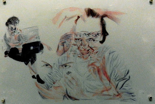
In order to give my work some parameters, I used the frame of a monitor screen commonly used for online communication. My aunt Paula and her husband Ergin met through online RPG gaming, and continued to game together after moving in. It's a modern love story, and an interesting model for this topic. I wrote up some instructions and sent them over to record a ten minute online conversation between the two of them. The setup of their webcams were completely their own decision, which led to an interesting twist to the work...in the  top left corner of Ergin's frame, Paula was in view for the entire conversation on her laptop. This added to the idea of technology manipulating our normal frame of perspective (being able to see yourself in the background of the person you are talking to...).


The resulting drawings have a surrealistic, Bacon feel, but were directed completely through their observations. 

This experience was rendered in biro material, using systematic resourcing and layering. 

I used the last observations at the top layer and worked backwards, omitting layers that would have been covered up by the top layers. 

This was my first experimentation with representing the passing of time within the work.
These were  very small drawings, too, around A5 and referenced to screenshots of the conversation at hand.


I was still testing where this project could lead, so decided to try a video installation of the original feed. The placement of the screens created new physical bodies back into the dynamics, but after a few meditations I decided upon a standard side by side, uniform layout with no audio playback.
The feedback from this strongly noted the colour scheme of the two videos (also uncontrolled) and the slow recognition of Paula in both screens.

Outcome: A video installation with observational plotlines


 At the time I had been interested in William Kentridge and Picasso. From the reactions I began looking more into Bacon and Hockney as key artists of research. I felt the influence and interest in Picasso was most relevant to me in my practice, and didn't want to become too influenced by work very close to my investigations.

- - - - - -


Later Dan Hays, Kusama and Marina Abramovij would lead my research into the 'Pixels'.
Methodical, repetitive, meditative. This was a good outlet for my work - very addictive and all consuming but productive, leaving me fresh to continue my research and drawing. This project looked into our online identities, recreating a tangible presence and dedicating time and attention to those we connect to on networking sites.

- - - - - -


In the third year, I continued with the conversation piece. I decided to keep the same method and change the material I was drawing on. In an attempt to reference the monitor screen or incorporate light into my work, I used architect paper to draw on.


The new subjects, Jake and Adam, used the same instructions, by witnessing this in person I was able to adapt them so it was easier to use. I also gathered more feedback directly from the participants in order to inform my work.


After working in A5 size again, I decided to try scaling up to life size drawings. I had to use pencil only, as colour would distract me from the composition itself.


Outcome: A3 renderings in mechanical pencil


- - - - - -

Taking a step back, 'stills' revisited each frame from the online video feed. I began creating frail, simple drawings of each frame, noting the time of capture in the top left corner. The frailty of the drawings reflected them as fleeting moments. The shadows emphasised taking the stills from the video reel and into a tangible form. 
I started hanging them up in a passageway. The breeze of people walking past forced an interaction with the viewers, as the 'stills' fluttered around their steps.


- - - - - -


Sunday, 10 February 2013

Reflections on the interim Exhibition at Artsite


How did the gallery context impact your work?

Removing our works from the studio space changed the impact they had.
By eliminating the walls and noise level, by changing the lighting and colour scheme, the gallery space allowed the works to stand on their own quietly, to take on more dominance of the space.
Working around the gallery, rather than my studio working around me, definitely affected the reading of my work.
The negative impact was the space I used didn’t allow for floor level hanging. Although the lower levels were easy to view, the height of the work couldn’t be effectively engaged with.
I knew this might happen, but was pleased to find people interacting with the lower tiers, leading them to decipher the whole body for themselves. This exposed the importance of space to my work (which, really ties into the very subject matter, and only confirms the preference to display it on ground level to the viewers).


On reflection, was the show curated well?

Bring your elbow grease and cleaning supplies ...
...for an interim white cube gallery!
With three days of intense cleaning, we hung all of the work within two days. The hardest part was the preparation, whilst, as a group and as individuals, the placement of work was quickly negotiated.


When place together, our works communicated in many ways, sharing a balanced array of qualities...


...texture and weight...

- - - - - -


...tonal quality...

- - - - - -
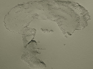

...and size.


...Not to mention how the works communicated with each other through their layout.

With six in the group, working in the space we had, we found ample room to display our works independently and connect to one another at the same time. The placement and assortment of sculpture, hanging work, drawings and shelved works allowed visitors to continually move through and around the dark and light.

This moving framework guided many people in a standard 8, tailing of to their own preferred works. 

What key responses did you gauge from your viewers, including your peers?

Of all the feedback recorded we had two negative comments, which were light remarks upon the ‘lack of colour’ within the room. Otherwise, many found the work unexpectedly challenging and interesting, offering a variety of drawing disciplines in an un-overwhelming way.

What specific strengths will you take forward to develop into your final major project and what weaknesses will you eliminate?

The concept of 'stills' was very well received and insightful.
Informed from this experience, I aim to recreate 'stills' for the final show. Next time, I will realise the use of space needed to allow viewers fuller interaction with the work.
Also, I will have fewer works on show, that I might better gauge how and why they should be placed.
At the interim show, I had intended to test how each of the works would be received, despite this causing the wall to become rather crowded. It was risky for the show, but for the long term gave me better insight into curating tactics as well as multiple methods of hanging works.
Having done this, I can now confidently move forward with works I feel interested in developing for the next show.


See you in three months time!

- - - - - -